

Ruby 2.6 preview 1: Timing JIT
/The new Ruby 2.6 preview 1 has JIT capability built in. Awesome! But it's still early. They say JIT doesn't help on Rails apps, for instance.
Purely by coincidence, I happen to write a big concurrent Rails-based benchmark, which Takashi was hoping to see JIT results for. And I'm freshly back to part-time work after paternity leave.
So how is its performance for Rails apps? Let's find out.
(Disclaimer: Takashi says that 2.6 head-of-master has significantly better JIT performance than prerelease 1. And I'll get around to timing that soon, too. But for now let's go with the 2.6 prerelease.)
Some Graphs
There's a way I usually graph this stuff. And several people have pointed out that I could do better with a line graph. And they're right, I totally could. So let's look at this how I usually do it, and then with some (I think) improved graphs.

I like the rainbow thing this graph has going. It's pretty. But commenters are right that it could be much clearer.
That bar graph lets you know: Ruby 2.6.0 prerelease 1 isn't much faster than 2.5.0. But how close? And the 2.6.0 bars with JIT (far right) are higher, so it's slower. But how much higher/slower? I usually clarify with a table, which kind of makes the graph redundant. Here's what that looks like:
| Percentile | Ruby 2.5.0 | Ruby 2.6.0 w/o JIT | Ruby 2.6.0 w/ JIT | speedup w/ 2.6 | speedup w/ 2.6 JIT |
|---|---|---|---|---|---|
| 0% | 29.79 sec | 29.69 sec | 32.21 sec | 0.35% | -8.13% |
| 10% | 32.62 sec | 32.01 sec | 36.34 sec | 1.85% | -11.42% |
| 50% | 34.35 sec | 33.94 sec | 38.34 sec | 1.20% | -11.60% |
| 90% | 35.35 sec | 34.89 sec | 39.58 sec | 1.30% | -11.95% |
| 100% | 36.75 sec | 35.92 sec | 40.79 sec | 2.25% | -11.01% |
It says pretty much the same thing: Ruby 2.6 is a tiny bit faster (let's call it 1.5% faster.) And with JIT it's much slower, more than 10% slower. Keep in mind this is a big, highly-concurrent Rails-based benchmark, which is exactly where we were told JIT was slower.
Still, we can do a better job presenting this data, I think. What if, instead of looking at a few representative percentiles of the full-run times, we took all 120,000 requests per Ruby (20 full runs, each with 6,000 requests,) sorted them from fastest to slowest, and overlaid them like a CDF? I think that would give us a pretty good view of how much faster or slower it is. Here's what that looks like:

I don't feel like this is as pretty. There are things I could do to improve it, obviously. But the biggest problem is that it's hard to estimate the total area between the curves in a wide, shallow graph like this. But I agree - this is an improvement.
Note that a small difference like the one between Ruby 2.5 and 2.6 is the worst case for a graph like this. It's about a 1.5% difference, as we saw in the table above. In fact, it's much smaller than that -- the 1.5% difference was aggregated and included a lot of the longer requests, while most requests on this graph are nearly the same between Ruby versions. Very few graphs will do a good job of showing that. And even the 2.6 with/without JIT difference isn't massive, at around 10%. Still, it's hard to recognize even the biggest, most important features of this graph, such as the fact that the slowest requests, with JIT, are much slower. And that's what you'd hope a graph like this would be best at.
Still, it's worth a look at the full-run version rather than the per-request version. Anything that shows every individual request, all 360,000 of them, is going to be, at best, too much information. What about just the 18,000 most important points, the aggregated run times?
Here's what that looks like:
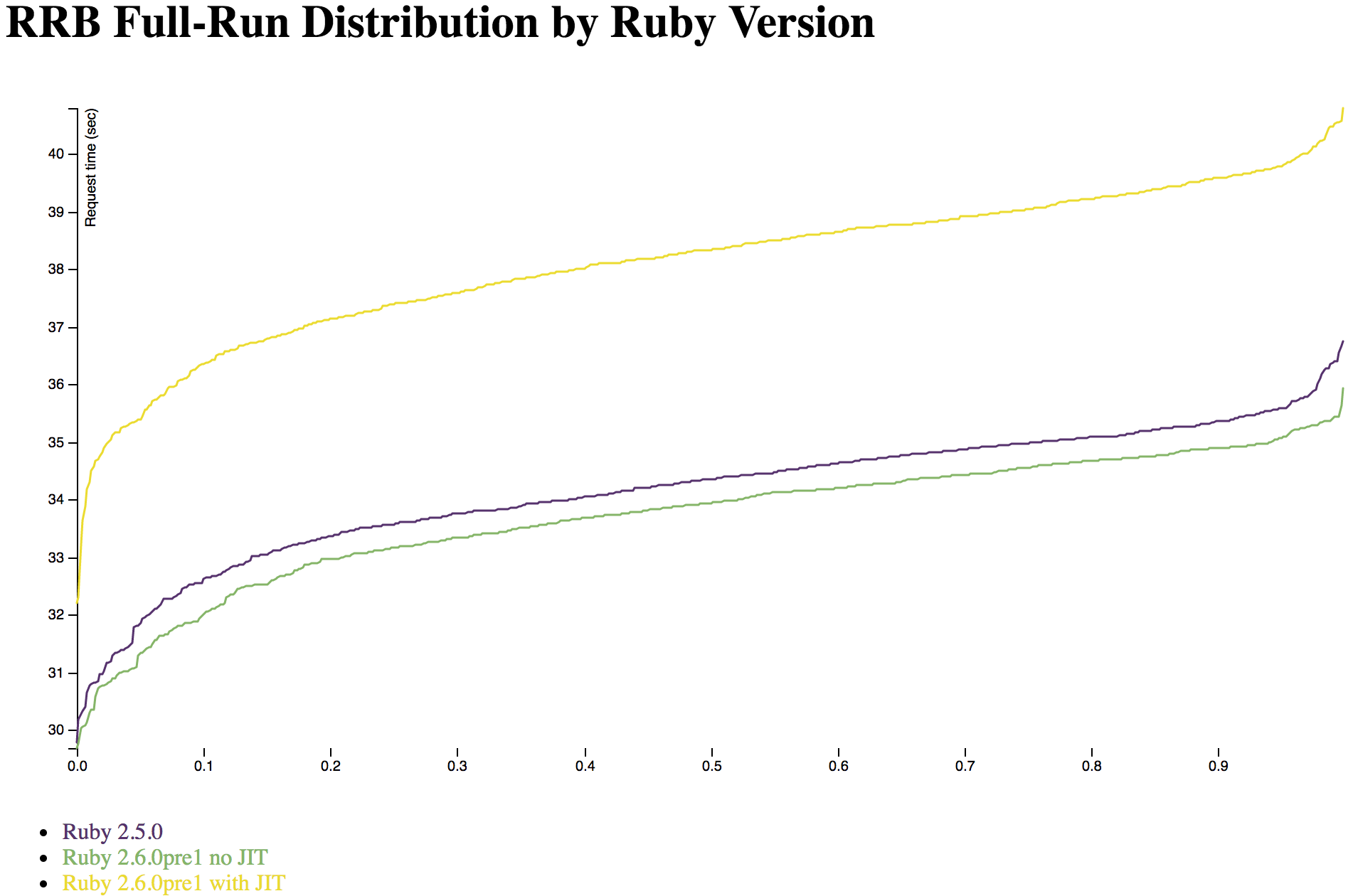
This makes you appreciate the buttery smoothness of the version with far too many points, doesn't it? 18,000 points sounds like a lot when I write it, but it's not really that huge.
This is the clearest graph so far, no question. By aggregating the full-run times, you can see that there's actually a lot of difference between the Ruby versions, even if most individual requests are very similar. In 6,000 requests, nearly every run is going to have something that is faster in 2.6, or much slower in 2.6 with JIT.
Also, the Y axis is zoomed in here. Notice that it runs from around 30 to 40 seconds, which is the basic spread for a full run of 6,000 requests for this benchmark. The individual-request graph had to start at zero because some requests are nearly instantaneous, while others take upwards of a second. This lets you see a lot more clearly what it means that the green and purple lines are "about 1.5%" apart - the fastest runs are very close together, the vast majority of runs are nearly a constant factor apart, and there are a few at the end that are outliers -- barely. As graphs go, this is a very orderly, neat one rather than a noisy one with lots of weirdness. Right now, Ruby 2.6 is a small, simple, uniform optimization and its JIT is a smallish, simple, uniform slowdown to this benchmark.
Methodology and Conclusion
Right now you don't want to use Ruby 2.6 JIT for your large, highly-concurrent Rails app, just like it said in the prerelease announcement. That makes sense. And don't worry, I'll be timing the newer 2.6 versions very soon. You'll find out when JIT breaks even for Rails Ruby Bench, and when it gets faster. I'll also try playing with different JIT settings a bit -- if I find anything interesting, I'll let you all know.
In case you haven't read my other articles on Ruby speed, this is all measured using Rails Ruby Bench (aka RRB.) RRB preloads Discourse with a bit of data and runs with with 10 Puma processes and 60 threads, then shoves pseudorandomly-generated HTTP requests through as fast as possible on a single large EC2 dedicated host. This gets more predictable benchmark results than you'd think, for reasons you can read about in my previous posts and on GitHub.
So: when you read about "how fast Ruby 2.6 prerelease 1 is" in this article, you're finding out how its speed looks for a large, real-world, highly-concurrent Rails workload. Other workloads will vary -- the Ruby 2.6 JIT is much faster on optcarrot, for instance.